If you’ve never worked with data, you might think that finding an open data set available through a trusted city provider would be the end of your journey.
And then, you’d open the data set, try to use it in your favorite visualization tool, and realize you had a long way to go.
No matter how careful and mindful a provider might be – some are, and some surely aren’t – there’s a distance between “entering things in a spreadsheet” and “getting a software to understand those things.” The length of that distance is called data cleaning, data scrubbing, data munging, data massaging. It all means: transforming the provided base data into a readable format for computers. A format that humans are often unlikely to provide.
This is not uncommon – in fact, it’s SO common that many data experts estimate 50-80% of a project’s time will be spent cleaning up your source data. With the project below, it was about 66%. It’s great to be on track!
For The Participatory Budgeting Project, I saw a real opportunity in the project data that was collected.
It was anonymous from the start, paid for by city money, and came from direct input from residents on things they’d like to see in their neighborhood. Rather than go Highlander and scrape together our own internal set of the data from internal records, we wanted to see this data be public, as it’s the right thing. Because New York City has an Open Data law in place, in the Spring of 2017 we were able to support the City Council Staff who worked hard to get the set together and over to the good people at MODA, who loaded the set onto NYC’s Open Data Portal. From there, we reasoned we’d get the data in a format that would be more transferable and shareable.
We were half right. It’s better, in my estimation, to use a set of data that’s already shared for the following reasons:
- It’s authenticated: We should be able to trust that the public institutions sharing public data are sharing correct, current content.
- It’s standardized: We’re all looking at the same numbers, outcomes, and information.
- It’s mechanized: If desired, you can pipe it in using an API rather than old-fashioned downloading.
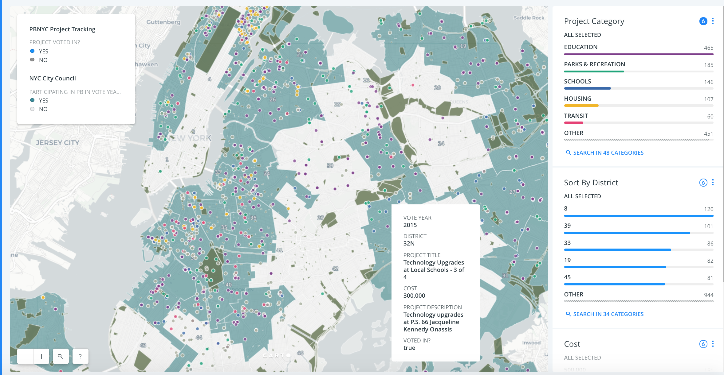
The trouble came in the need for cleaning. The set of data that was available tucked several projects into one row many times, had no geolocation, and had non-standardized addresses (“Corner of Cortelyou and E18th” anyone?).
With the good help of an intern, we broke out each project individually, standardized the categories and addresses, and loaded the content into an instance of CARTO in which we were able to customize design.
Here’s a snapshot of the map we created, click it to visit the live map:
The next steps for this project are exciting – having created a standardized data model for civic project input gathered from participatory budgeting (PB), I’m working to expand the reach of the model by submitting data sets to other cities where PB takes place.
Further, the Participatory Budgeting Project received a grant to expand greatly on this project, and after getting to hire a new team member for it, I’m excited to say that a mobile-optimized project tracker is currently being built!